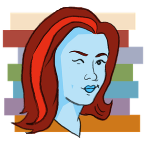
Wow, it’s been awhile, hasn’t it? Several months ago I commissioned a new header from Matt over at Scrubbles. (In exchange I’m knitting him a custom scarf.) Isn’t it fantastic? Feels like a whole different vibe. I also love the retro, half-alien half-Samantha-from-Bewitched portrait he drew of me. I’m still tweaking link colours and stuff, so let me know if you find anything that looks odd.
Note: You may need to do a control-refresh to grab the new version of the stylesheet. If you’re seeing a non-white background, you’ve still got the old version.

Comments
20 responses to “New design!”
I love it except for your face;s blue tint. It makes me think you’re cold or suffocating. 😉 I am drunk rught now though, so I could be skewed.
That’s the alien-like part! 🙂
That’s a fabulous banner!
The black text is hard to read on your background colour, though. For me, at least.
it looks awesome! love it!
Which background colour, SlythErin? Should be white in all the main area. You mean one of the small boxes on the right? (You guys may need to do a control-refresh to make sure you’re not seeing the old CSS file.)
I like it. Very crisp and clean.
Loving it! Really fresh with a great graphic.
Ah, now it’s white. It was showing up purple before. Much better!
That refresh button does wonders.
Love it!
Lovely! I wondered why your Ravatar had changed, but this explains it. Looks just like you, of course!
Really nice! I always knew you were an alien 🙂
I love it–fun and colorful but still uncluttered. Perfect 10!
very nice!
I like it a lot, especially the way the portrait actually does look like you (aside from the Samantha flip and the blue skin). Nice!
Looks great, RT!
Great palette. I love those colours and the way that they’re picked up through the site.
I like them too! I had to reduce the intensity a little in the side boxes to make the text readable.
Good Job, Kris. I do like the portrait!
eh. i don’t like change. but i guess i’ll get used to it.
really, what weirds me out most is how much more that portrait looks like MOM than you! but i guess you’re one in the same. WEIRD, WHERE DID I COME FROM….
Ha! It’s awesome. It took me by surprise too.